
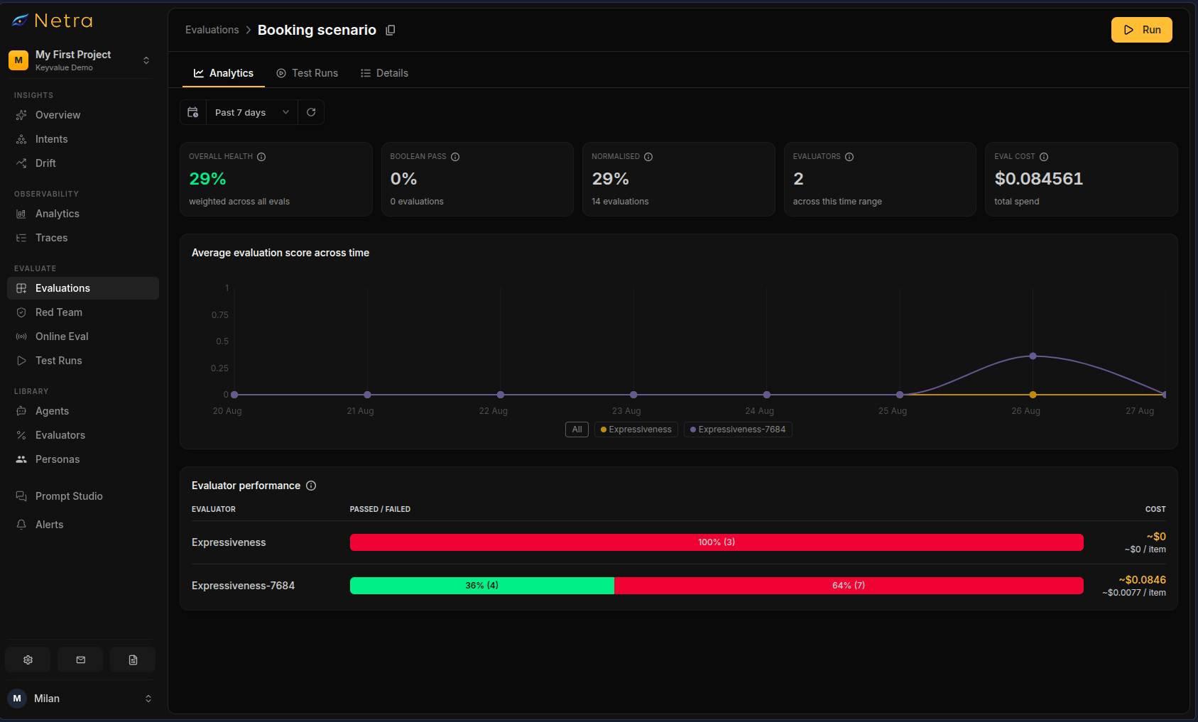
Overall Health
The top of the Analytics page displays a summary card with four key metrics:Average Evaluation Score Across Time
A line graph plots the normalized evaluation score over time. Each data point represents one test run. Use this chart to:- Spot trends — a declining line indicates gradual quality degradation
- Identify regressions — a sharp drop after a specific run pinpoints the change that introduced the issue
- Validate improvements — confirm that score increases after prompt or model updates
Evaluator Performance
Below the score graph, an evaluator performance card breaks down results per evaluator:
Each evaluator is listed as a separate row, letting you quickly identify which evaluator contributes most to failures or costs.
How to Use Analytics
Track Quality Over Time
- Run the same evaluation after each deployment or model change
- Open the Analytics tab to see the score trend
- Investigate any dips or regressions in the graph
Identify Weak Evaluators
- Review the Evaluator Performance card
- Focus on evaluators with the lowest pass rates
- Tune those evaluators or investigate the underlying AI behavior
Monitor Costs
- Check the Eval Cost in the overall health card
- Review per-evaluator costs to identify expensive evaluators
- Optimize prompt size or evaluator frequency if costs grow unexpectedly
Related
- Test Runs - View detailed results for individual test runs
- Evaluation Overview - Understand the evaluation framework
- Evaluators - Configure scoring logic and criteria